The forecast correctly predicted the button would hit zero on May 23rd. I see that the timer did not expire as a result of low latency “zombie” botting, but we have a 0.00 timer displayed on the day I was predicting. The final forecast was set on May 16th, seven days earlier. I am pleased that the forecast was accurate so many days out, I was worried about posting a flurry of +3 and +2 day forecasts before it ended. While a detractor would say my forecast did update and change with new data, the technique remained comfortably in the ARIMA family each time. Most importantly, the only forecast to expire was correct, seven days ahead.
I will not continue to manually update the forecast given that the lower bound of zero has been reached. Keep an eye out for code to be released.
Below is the final forecast, announced 5/16:
The current forecast suggests the button will end on the 23rd. On a positive note, the forecasts have been getting shorter and shorter as I have updated them. The first forecast was +15 days, then +12, +13, and +8. This current one is +7. I am still hoping to get two forecasts which both suggest the same day, but I imagine the trends are changing over time faster than my technique allows.
The grey confidence interval suggests that the timer will probably never over 30 seconds for any 10 minute period again. If you want a badge indicating less than 30 seconds, you will always be able to find it if you wait for, at most, 10 minutes, even during peak hours. Very few people will have to wait that long.
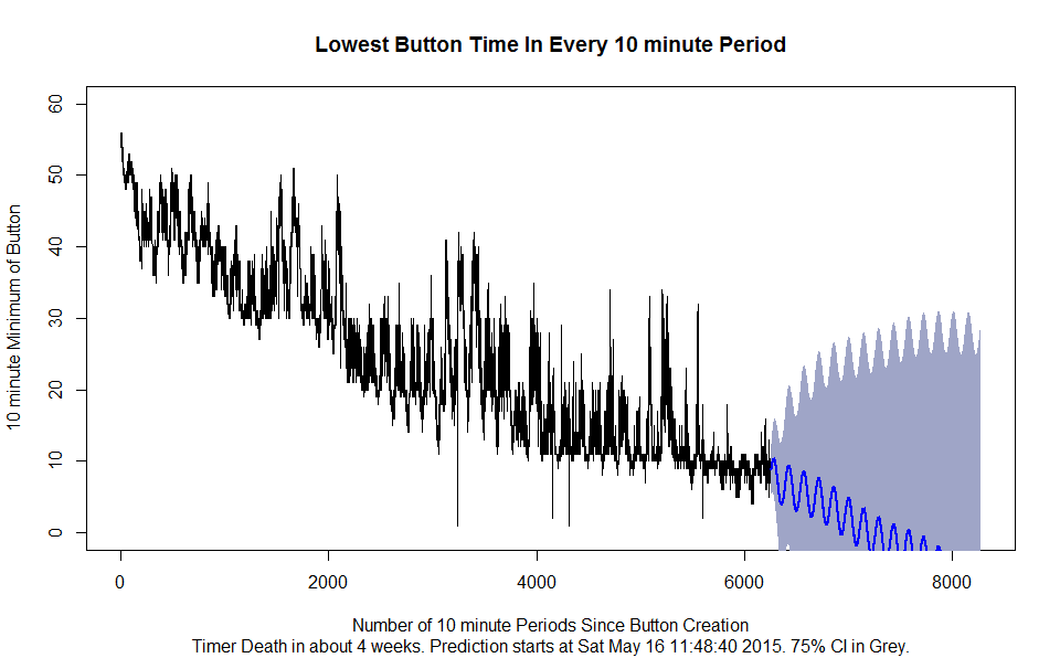
Each cycle or wave in the graph is approximately one day, representing the daily cycle of activity on the button, high in the afternoons, low in the late nights/mornings. There is also a slight weekly cycle, but it is not easy to notice in the plot.
The button’s values have partially stabilized with a pretty persistent protection around the red barrier, but there is still some noticeable decay between the 4000 and 6000 period marks. I have continued to use an indicator for the lowest observed badge color to help soften the impact of the early periods, when it was impossible to get a low badge color due to the frequency of clicking. We are now in a period where it is demonstratively possible to get red, with patience and discipline- we have observed red badges occur. Using the lowest observed badge color as a variable allows us to separate out this current period from earlier ones where the data was less descriptive of the current state.
Out of the grey collection of possible futures highlighted, it looks like button is declining steadily, the general future looks rather grim. The upper line of the grey 75% confidence interval is below 30 seconds, suggests that the timer will not be kept at over half for a full 10 minutes ever again. [This prediction did not end up to be true.] I note that the existence of a good forecast means that the red guard can simply pay extra close attention to the period in which they think it will end, and this forecast might actually extend the life of the button. Maybe.
Methodology
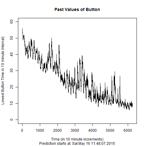
First, I downloaded the second-by-second data at about 5/16 at 12:00pm CST from here. To ease the computational load and reduce unwanted noise in the forecast, the 4+ million data points were aggregated from seconds into intervals of ten minutes each. I examine only the lowest value of the timer, since the topic of interest is when the timer hits zero. (This strikes me as somewhat ad hoc, because the distributions of minimums are likely non-normal, they would be from an extreme value distribution.) Below is a plot of the ten minute minimums for the button. Each cycle is about a day, and there appears to be a weekly cycle that is very slight.
I exclude any period where the timer was not well recorded for technical reasons, which has helped return the forecast to normal after the “great button failure”. I am much more confident in this current forecast as a result. New to this forecast, I have also added a dummy indicator for the lowest badge observed. It began as purple, and then slowly slid to red. We are in a post-red period, but when the button began, we had only seen purple. The structure of the model ought to reflect that. This significant set of variables suggests that the button’s lowest observed value in a 10 minute period is sinking at an accelerated pace compared to the early stages of the button.
Then, I estimate the process using ARIMA(1,1,1) and weekly, daily, and hourly Fourier cyclical components. I include one pair of sin() and cos() waves to catch any cyclical trends in weeks, days, or hours. This is roughly the same technique I used to predict the next note in Beethoven’s Symphony, which worked with 95+% accuracy. They tend to fit very well, and in fact, I am often shocked by how effective they are when used correctly.
Below I show how well the past data fits with our model model. This type of extreme fit is typical when ARIMA sequences are applied correctly, and only shows that I do seem to fit the past reasonably well. I check this plot to ensure that my forecast does not predict impossible amounts and it stays between 0-60 for our past data.
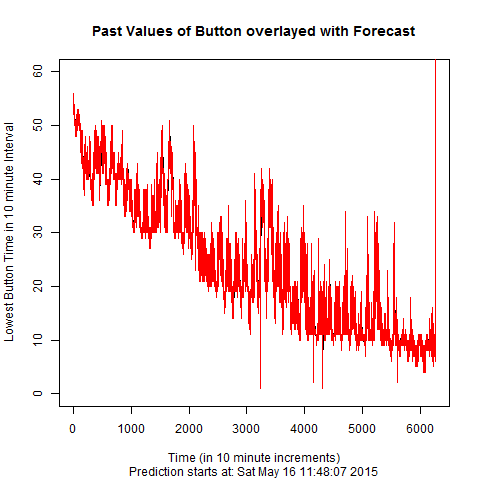
The fit appears to be very good, better than prior weeks, suggesting my model is better now that I have included lowest observed badge. There are few periods where the forecast is very off base. (I am not sure why the last line spikes up so much, I would like to take a careful look at the code to see what’s going on, that spike is not part of ARIMA and therefore is a problem within my forecast, likely involving the very last period.)
Below, I show the errors of the forecast above. At this scale it is clear there are a few days where my model misjudges the fit. I am unsurprising by this, given I have about so many observations, but I am disappointed some intervals are incorrectly predicted by 20 seconds or more. This is the cost of estimation, perhaps.

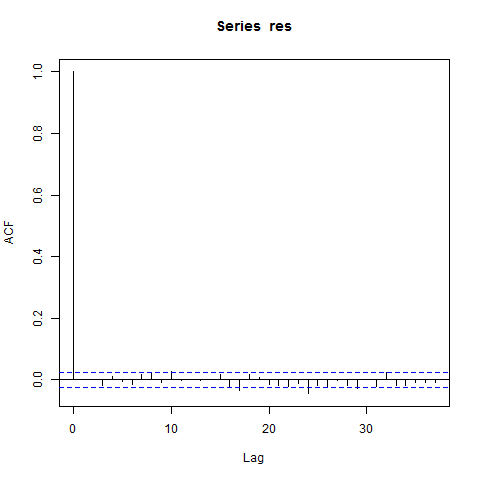
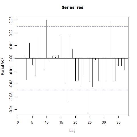
On to more technical details. My process looks at its own previous values to make a forecast. I need to make sure that my sequence is not missing critical associations. Let us see how well the past values are associated with a current one. Big lines mean big association. We call plots of these correlations the ACF and PACF. I plot them below. They suggest our fit is relatively well done. (They fall mostly within the blue lines for many/most steps, the first of the ACF is excluded, because the current value is 100% equal to itself.) For these steps that are outside of the blue in the PACF, I doubt the sequence has 25 lags or leads, and such things are not quickly calculable on a home computer anyway, so I am going to reject them as a possibility. Adding too many terms and over-fitting the data would be equally unwise.
I avoid looking at the Augmented Dickey-Fuller Test because I am looking at minimums, and therefore have concerns about the normality of the errors, but have considered it.
Commentary on Other predictions Types and Styles:
Some are attempting to use the remaining number of greys. I am currently not encouraged that this approach is good. I note that the count of remaining greys appear to be largely insignificant in predicting the next lowest value of the button. (I have tried to include them in a variety of ways, including natural logs, and they did not influence the prediction.) I conclude from this that the number of greys largely is irrelevant. I suspect that a portion of the greys are pre-disposed to click, and this proportion of “click eventually” vs “never-click” matters more than the total number of greys, but I suspect this proportion fluctuates dramatically from minute to minute and I cannot isolate what the true proportion is without serious adjustment in my technique.
Some are attempting to predict the button failure by a clicks/minute approach, which I am intrigued by, but I have not investigated this closely as an approach.
I note that I have some reservations about the asymptotic validity of my estimators. I am investigating these currently.
Historical Forecasts
To see how my forecast changes, and in the interest of full disclosure, I will keep tabs of my past estimates and note how additional data improves or worsens these estimations.
Current Update (5/16) – May 23rd. Noting that previous updates have all shrunk distance to button failure: +14 days, then +13, +13, and +8. This current one is +7, within a week.
Updated Badge Technique (5/11) – May 19th New Technique Added: Used lowest observed badge color to help separate out the pattern of early periods (the purple, blue, orange periods) from the late patterns (the post-red period).
Revisiting the Forecast (5/3) -May 16th
Update: After Button Failure (4/27) – May 9th.
Great Button Failure Update (4/26) – May 28th, likely in error.
Initial Forecast (4/24) – May 8th.
Code
#Load Dependencies
#install.packages(“corrgram”)
#install.packages(“zoo”)
#install.packages(“forecast”)
#install.packages(“lubridate”)library(“zoo”, lib.loc=”~/R/win-library/3.1″)
library(“xts”, lib.loc=”~/R/win-library/3.1″)
library(“lubridate”, lib.loc=”~/R/win-library/3.1″)
library(“forecast”, lib.loc=”~/R/win-library/3.1″)#Source of data: http://tcial.org/the-button/button.csv
button button$time<-as.POSIXct(button$now_timestamp, origin=”1970-01-01″) #taken from http://stackoverflow.com/questions/13456241/convert-unix-epoch-to-date-object-in-r
#Surprisingly, this feeds several periods of wrong time for just shy of 720 seconds. They are all zero.
#I must manually input a minimum for the button- prior to button time hitting zero, there had been false zeros, for lack of a better word.
button$seconds_left[button$seconds_left<1]<-99#First there is the missing data. There is the periods between clicks where the timer clicks down by 1 second, and actually missing data. The ticking down periods are irrelevant because every click always happens at a local minimum.
#Get opening and closing time to sequence data.
time.min<-button$time[1]
time.max<-button$time[length(button$time)]
all.dates<-seq(time.min, time.max, by=”sec”)
all.dates.frame<-data.frame(list(time=all.dates))
#merge data into single data frame with all data
merged.data<-merge(all.dates.frame, button,all=FALSE)
list_na<-is.na(merged.data$seconds_left)#I trust that I did this correctly. Let us replace the button data frame now, officially.
button<-merged.data#let us collapse this http://stackoverflow.com/questions/17389533/aggregate-values-of-15-minute-steps-to-values-of-hourly-steps
#Need objects as xts: http://stackoverflow.com/questions/4297231/r-converting-a-data-frame-to-xts
#https://stat.ethz.ch/pipermail/r-help/2011-February/267752.html
button_xts<-as.xts(button[,-1],order.by=button[,1])
button_xts<-button_xts[‘2015/’] #2015 to end of data set. Fixes odd error timings.
t15 min.
end<-endpoints(button_xts,on=”seconds”,t*60) # t minute periods #I admit end is a terrible name.
col1<-period.apply(button_xts$seconds_left,INDEX=end,FUN=function(x) {min(x,na.rm=TRUE)}) #generates some empty sets
col2<-period.apply(button_xts$participants,INDEX=end,FUN=function(x) {min(x,na.rm=TRUE)})
button_xts<-merge(col1,col2)# we will add a lowest observed badge marker.
min_badge<-c(1:length(button_xts$seconds_left))
for(i in 1:length(button_xts$seconds_left)){
min_badge[i]<-floor(min(button_xts$seconds_left[1:(max(c(i-60/t,1)))])/10) #lowest badge seen yesterday is important.
}
#let’s get these factors as dummy variables. http://stackoverflow.com/questions/5048638/automatically-expanding-an-r-factor-into-a-collection-of-1-0-indicator-variables
badge_class<-model.matrix(~~as.factor(min_badge))#Seasons matter. I prefer Fourier Series: http://robjhyndman.com/hyndsight/longseasonality/
fourier {
n X for(i in 1:terms)
{
X[,2*i-1] X[,2*i] }
colnames(X) return(X)
}
hours<-fourier(1:length(index(button_xts)),1,60/t)
days<-fourier(1:length(index(button_xts)),1,24*60/t)
weeks<-fourier(1:length(index(button_xts)),1,7*24*60/t)
regressors<-data.frame(hours,days,weeks,badge_class[,2:dim(badge_class)[2]]) #badge_class[,2:dim(badge_class)[2]] #tried to use particpants. They are not significant.#automatically chose from early ARIMA sequences, seasonal days, weeks, individual badge numbers are accounted for as a DRIFT term in the ARIMA sequence.
#reg_auto<-auto.arima(button_xts$seconds_left,xreg=regressors)
reg<-Arima(button_xts$seconds_left,order=c(1,1,1),xreg=regressors,include.constant=TRUE)
res<-residuals(reg)
png(filename=”~/Button Data/5_20_acf.png”)
acf(res,na.action=na.omit)
dev.off()
png(filename=”~/Button Data/5_20_pacf.png”)
pacf(res,na.action=na.omit)
dev.off()#Let’s see how good this plot is of the hourly trend?
t.o.forecast<-paste(“Prediction starts at: “, date(),sep=””)
png(filename=”~/Button Data/5_20_historical.png”)
plot(fitted(reg), main=”Past Values of Button”, xlab=”Time (in 10 minute increments)”, ylab=”Lowest Button Time in 10 minute Interval)”, ylim=c(0,60))
mtext(paste(t.o.forecast),side=1,line=4)
dev.off()
png(filename=”~/Button Data/5_20_error.png”)
plot(res, main=”Error of Forecast”,,xlab=”Time (in 10 minute increments)”, ylab=”Error of Forecast Technique on Past Data”)
mtext(paste(t.o.forecast),side=1,line=4)
dev.off()
png(filename=”~/Button Data/5_20_overlay.png”)
plot(fitted(reg), main=”Past Values of Button overlayed with Forecast”,xlab=”Time (in 10 minute increments)”, ylab=”Lowest Button Time in 10 minute Interval”, ylim=c(0,60))
mtext(paste(t.o.forecast),side=1,line=4)
lines(as.vector(button_xts),col=”red”)
dev.off()#forecast value of button:
#size of forecast
w n<-7*24*60/t
viable<-(dim(regressors)[1]-n):dim(regressors)[1] #gets the last week.
forecast_values<-forecast(reg,xreg=regressors[rep(viable,w),],level=75)
start<-index(button_xts)[1]f_cast<-append(forecast_values$x,forecast_values$mean)
a=as.Date(seq(start, by=”15 min”,length.out=length(f_cast)))png(filename=”~/Button Data/5_20_forecast.png”)
plot(forecast_values,ylim=c(0,60), main=”Lowest Button Time In Every 10 minute Period”, ylab=”10 minute Minimum of Button”, xlab=”Number of 10 minute Periods Since Button Creation”)
footnotes<-paste(“Timer Death in about 4 weeks. Prediction starts at “, date(),”. 75% CI in Grey.”,sep=””)
mtext(paste(footnotes),side=1,line=4)
dev.off()


Leave a comment